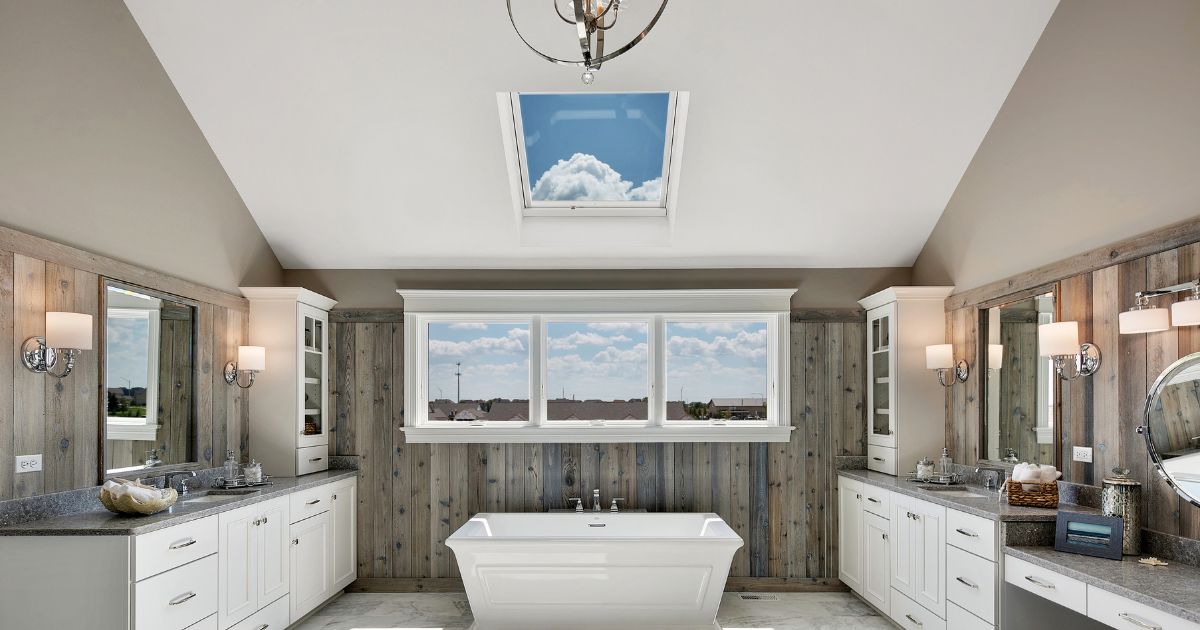
A bathroom remodel may be an overwhelming venture, but it can make a dramatic difference to the feel and the overall value of your home. Despite being categorized as one of the smaller rooms, bathrooms deserve the same design power as any other larger space.
However, since the task carries a substantial price tag, we recommend beginning with research and inspiration before starting the project. Remember, the best clients are often the most informed. And this is important. Before putting down your money in an expensive project such as this, you need to have a clear idea of how the lack of certain features and amenities is impacting your life.
These before and after pictures of bathroom remodel projects will give you an idea of how successful transformations can change the entire vibe of the bathroom. You may also be inspired to play around with different ideas to reach a perfect design theme for your bathroom.
Lessons We Can Learn From Successful Before and After Bathroom Remodel Projects
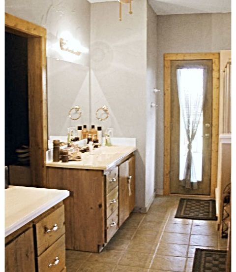
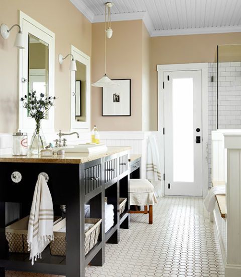
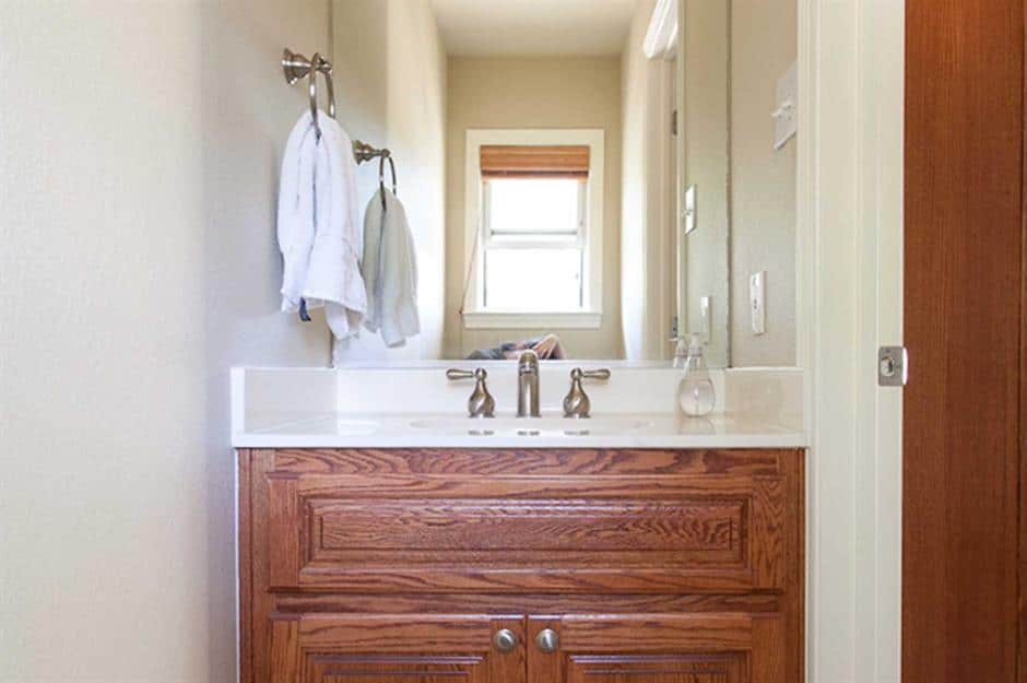
1. Before: Boring and Bland Wooden Cabinetry, After: Full of Character
The bathroom looks completely dated before the remodel. It’s as clear as day that the space has not been touched up in years. The bland wooden cabinetry adds another dismal touch to the space.
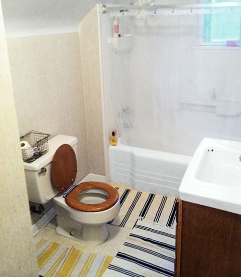
2. Before: Claustrophobic and Uninteresting, After: Completely Luxurious
It is crystal clear that this lackluster bathroom is in a serious need of style revamping. The scarcity of space adds to the already cheerless picture.
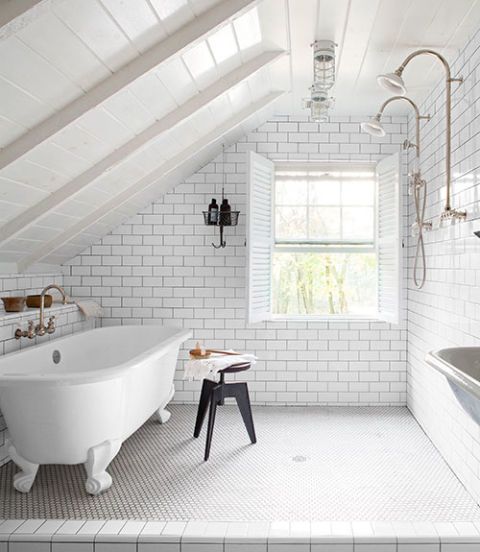
Notice how the unimaginative space is developed into a luxurious den by gutting the second-story crawl space. The dual shower creates a chic yet elegant ambiance. The claw-foot tub with the graceful fittings is the cherry on the cake. The window in particular is widened while the floor is deliberately made to tilt to facilitate drainage.
3. Before: A Nondescript Toilet, After: Simple and Suave
The before bathroom remodel version in the picture can easily pass off as a classic example of boring humdrum! However, what’s interesting here is that it cost the owner only $100 to turn it into an exclusive retreat.
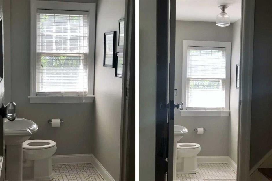
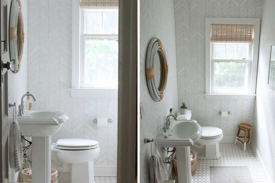
The walls are painted a soft grey to lighten up the space. Hereafter, stencils are used to create a herringbone feature impact on the walls. The stylish yet simple arrangement is further set off by a DIY rattan mirror and a bamboo blind- which in unison with the rest of the elements appeal to the user’s sensibilities and create a meaningful whole.
4. Before: Basic and Bare, After: Dark and Charismatic
The picture speaks all. The cloakroom depicted above may be functional but that’s all there is to it. Let’s admit it. The space is completely devoid of personality and substance.
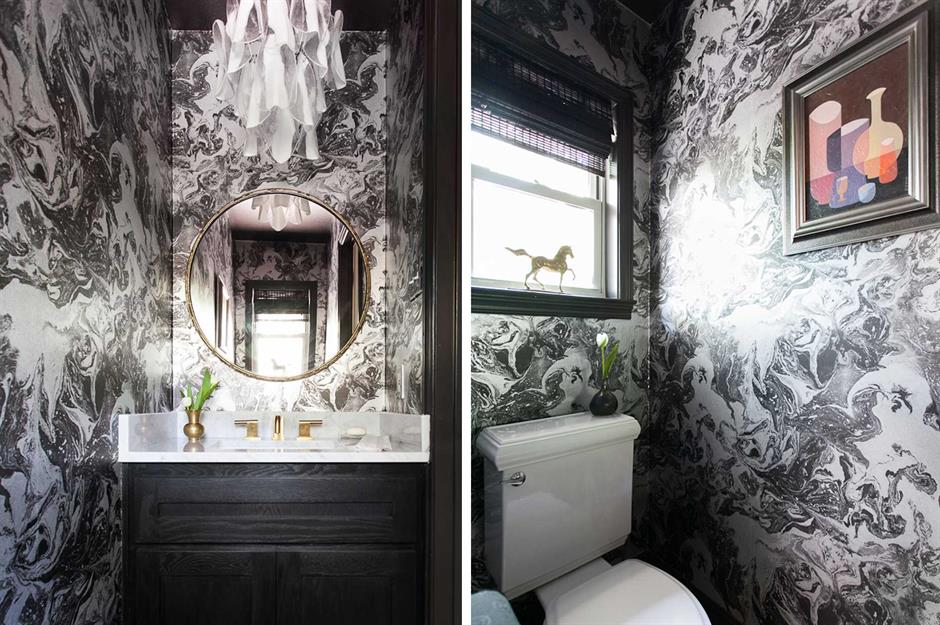
The wallpaper in zinc is the show-stopper in the newly transformed cloakroom. The dramatic appeal continues with the black ceiling, vanity, and black blinds. The luxe white chandelier and mirror in brass add to the mysterious aura created within.
5. Before: Blank and Drab, After: Rustic Accent wall
The bathroom as the picture speaks lacks everything: color, decor, and style. In short, the space needs a facelift, big time.
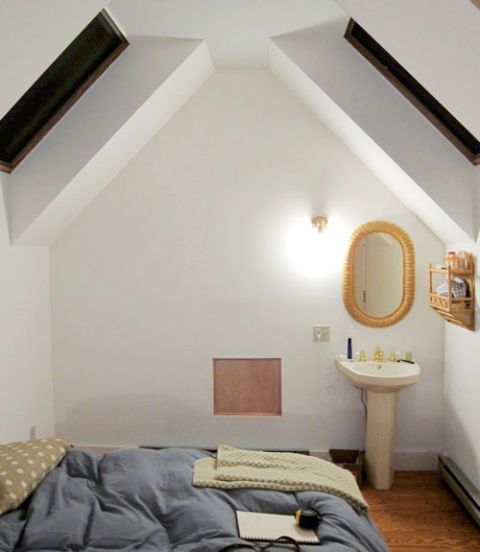
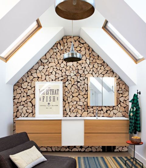
The rustic accent wall turns out to be the primary focal point in the refashioned bathroom. The rest of the walls are licked a pristine white and stand juxtaposed to the woodsy impact created by the accent wall. The windows are completely done away with. Instead, a pair of skylights flood the entire space with lights from above.
6. Before: A One-Time Walk-In-Wardrobe, After: Modern and Elegant
The room as shown in the picture used to be a walk-in wardrobe. However, the space at present is completely stripped of clothes storage. The new plumbing is laid and all it needs is to be redesigned into a master ensuite bathroom.
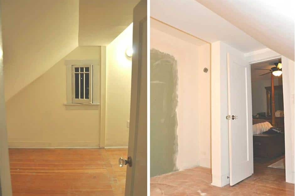
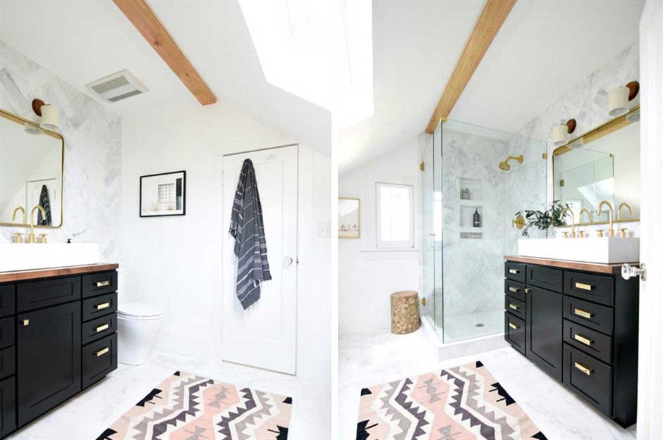
The altered room takes on a sleek monochrome scheme that further pairs with warm wood accents. The walk-in closet resurrects into a walk-in shower and a gigantic double vanity unit. Catch the grey marble tiles in a herringbone pattern that sets a stylish edge to the room. The gleaming brass fixtures provide a striking contrast to the dark vanity and enhance the opulent element in the room. The pretty pink and black rugs in boho pattern work to complete a harmonious amalgamation of the design elements in the newly designed bathroom.
7. Before: All Peach and Dull, After: An Enticing Country Design Scheme
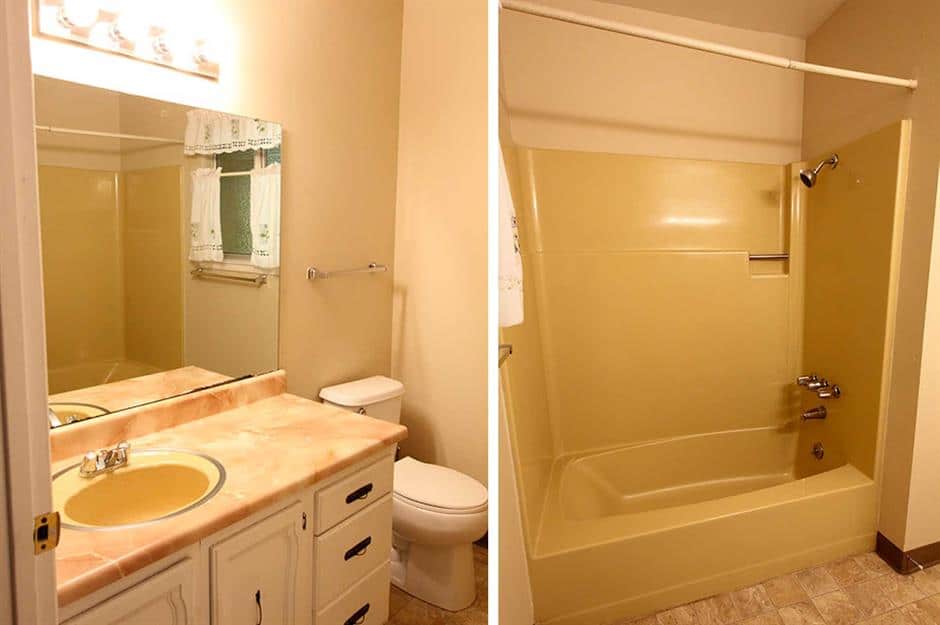
The sight of the retro bathroom above is enough to inspire any designer to rake up his creative instincts in a big way! The all peach look exudes a dreary and dingy hue all over the space. The closed-in bathtub is another uninspiring element that adds to the already bleak picture.
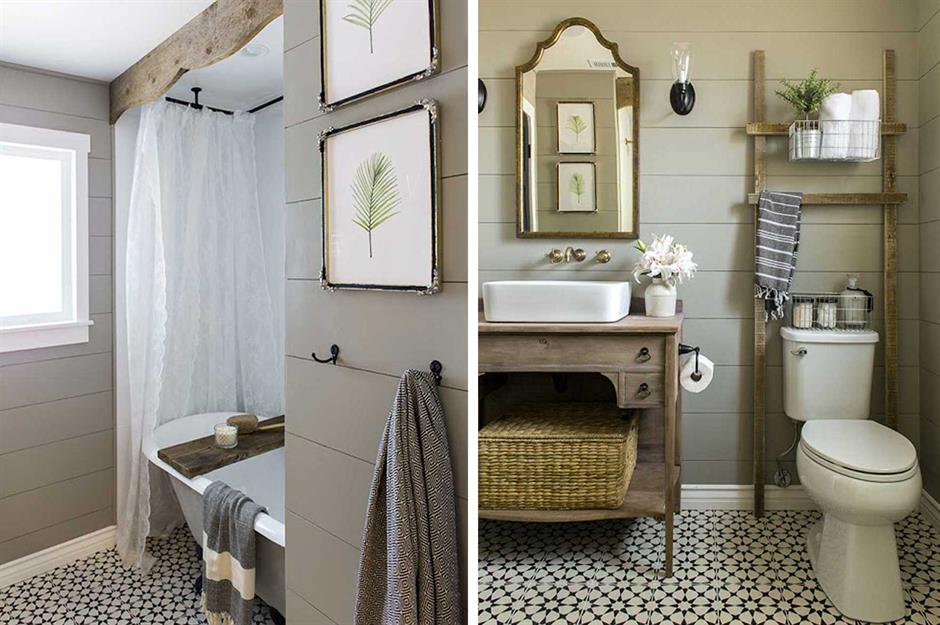
Notice how the vintage look is inserted in the once outdated and bleary space. Wherever you turn, you come across a subdued mix of metals, boho patterns and subtly layered tones that lie perfectly in line with each other. Details like the accent mirror, the pretty lace curtain, and the ladder contribute to the soothing vintage charm.
Final Words
There are no two ways about it that renovating your bathroom is one of the most important investments you can make from a resale point of view. However, other than this lucrative factor, it is a pleasure to inhabit a place that leaves you happy and at peace with yourself at the end of the day. A well-designed bathroom is a great way to begin your day which eventually influences your perception towards life and your personality in more ways than you can imagine.


