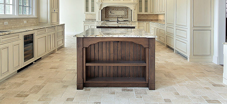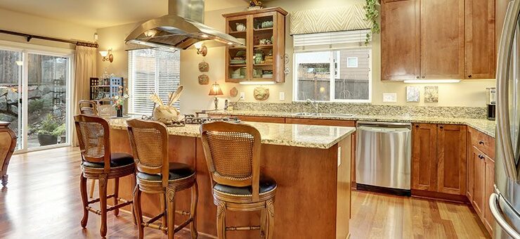
Choosing colors for a home remodel can be tons of fun. It can also be a bit nerve-wracking. Changing your mind 6 months after you paint isn’t ideal, so you want to hit the right note the first time.
If you’re planning on making a color-scheme change in your kitchen, bathroom, or another room of your home in 2024, you’ll appreciate some guidance.
Paint is a powerful and affordable way to completely update and refresh a space. But with so many gorgeous colors to choose from, picking the perfect one can be tough.
Here’s a look at some of the hottest color trends for home remodeling in 2024, along with expert advice on where they’ll shine in your home:
1. Clark+Kensington: Breezy Blues
Stainless Steel (or similar cool, light periwinkle tones) is a fantastic choice for brightening up a room. It pairs beautifully with charcoals for a classic look, or adds a trendy pop when used with oranges. Living rooms, bedrooms, kitchen accents, and bathrooms are all great places to experiment with this airy shade.
2. Behr: Tranquil Teal
Behr’s Blueprint is described as “warmer than denim, but softer than navy.” This calming blue-green creates a serene atmosphere in kitchens, bathrooms, or as an accent wall in a bedroom. It can also be a statement piece on a coffee table or bench.
3. Valspar: Zest for Life Orange
Embrace the vibrant energy of orange with Valspar’s Orange Slice! This playful hue works wonders when mixed with pale yellow, neutral gray, or a refreshing mint green. Liven up a guest bedroom or home office with this cheerful pop of color.
4. HGTV Home by Sherwin-Williams: Serene Escape
Reflecting Pool is a soft, calming green-blue that can also be surprisingly fun when paired with bolder colors. Keep it tranquil by using natural hues alongside it. This versatile shade can be used in any room of your home!
5. PPG Diamond: Lush Greens
Calling all nature lovers! Night Watch by PPG Diamond brings the beauty of a lush forest right into your home. This deep green is perfect for a dining room or bedroom, especially in spaces without a direct view of the outdoors.
6. Sherwin-Williams: Earthy Elegance
Cavern Clay by Sherwin-Williams offers the warmth and comfort of terra-cotta. Create a cozy and inviting feel in your kitchen or dining room by pairing it with bright tiles, warm stone accents, and a touch of greenery.
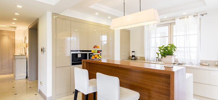
7. Benjamin Moore: Timeless Neutrals
Looking for a sophisticated gray with a calming effect? Look no further than Benjamin Moore’s Metropolitan. This cool-toned neutral creates a peaceful ambiance in any room. It’s perfect for living room walls (especially when balanced with warm accents), minimalist kitchens, or a dreamy and elegant bedroom.
Still Feeling Unsure?
Decisions, decisions… it’s okay to need help
What color should you choose for your space makeover?
It’s always a good idea to consult a professional when you’re doing any home renovation or remodeling. Work with an expert who can also provide you with the advice of a design expert.
For help remodeling your home, contact your local experts VKB Kitchen and Bath.
Frequently Asked Questions
Q1: How can I choose the perfect paint color for my home?
Answer: Choosing the perfect paint color can be tough! Consider the mood you want to create in each room, the existing decor and furniture, and how natural light affects the space. Look for inspiration from magazines, online resources, or consult with a professional designer.
Q2: Where can I use breezy blues like Stainless Steel by Clark+Kensington?
Answer: Breezy blues like Stainless Steel are great for brightening up living rooms, bedrooms, kitchen accents, and bathrooms. They pair beautifully with charcoals for a classic look or add a trendy pop when used with oranges.
Q3: What are some ways to incorporate earthy elegance with Cavern Clay by Sherwin-Williams?
Answer: Cavern Clay offers warmth and comfort. Use it in your kitchen or dining room paired with bright tiles, warm stone accents, and a touch of greenery to create a cozy and inviting feel.
Q4: Can I use Night Watch by PPG Diamond in any room?
Answer: Night Watch, a deep green color, is perfect for a dining room or bedroom, especially in spaces without a direct view of the outdoors. Its lush green hue brings the beauty of a forest into your home.
Q5: How can I balance bold colors like Zest for Life Orange by Valspar?
Answer: Bold colors like Zest for Life Orange can be balanced by pairing them with pale yellow, neutral gray, or refreshing mint green. Use them in spaces like guest bedrooms or home offices to add a cheerful pop of color.